


 Log In
 Register
 Home
Home


 Topic RSS
2:03 pm

Site Veteran
February 12, 2013
 Offline


that 1 is hilarious, his neck does look horrible lol
5:53 pm
Site Veteran
Members
May 23, 2012
Offline
Glad you enjoyed it, I can’t believe that would sell better then the original. Why did Nintendo of America get the worst commissioned artist to do these covers ![]() some of them are tragic.
some of them are tragic.


The Nissin Food Products Company apparently needed some kind of medium to attract more attention to their noodles. They decided to go with a scrolling beat ’em up based on a superhero they created, for the Super Famicom. While it is similar to what Burger King did with Sneak King over a decade later – some admirable effect went into trying to create an enjoyable game.


You know what, I’m now thinking of getting this myself !!
11:50 am
Site Veteran
February 12, 2013
Offline
What bizarre concepts…that made it into Sneak King lol
9:48 am
Site Veteran
Members
May 23, 2012
Offline

Wouldn’t want to be in the ring with this dude. It’s Kinnikuman and he gains power from eating garlic for some strange reason.
12:23 pm
Site Contributor
Site Contributor
February 12, 2013
Offline
tkbryant said
One of the WORST for any system EVER!!

I think Phalanx has one of the BEST covers in videogame history. The game is a generic shmup that is totally forgettable, yet we’re still talking about it to this day due to its extremely bizarre box art. The box art did a great job of helping the game stand out in a sea of early 90’s shmups.
Now playing: SNES - Phalanx, R-Type III, Genesis - Bio Hazard Battle, PS3 - Dragon's Crown
9:06 am
Administrator
February 11, 2012
Offline


Wow Ghost. You’ve enlightened me to games I’ve never heard of before. I bought Maka Maka. I’m thinking of buying its sequel. I may also get Laplace no Ma, seems very interesting.
11:29 am
Site Veteran
Members
May 23, 2012
Offline
Glad I could be of assistance. I’ve got a modest SFC collection, nothing on an industrial scale but I tend to look out for niche titles and unknown gems that slip through the radar of most people. Even stuff like Maka Maka which has a bad reputation – there was enough about it to intrigue me to try it. I think it helps that I kinda have a liberal attitude when it comes to SFC games but I liked it and at the end of the day only you as an individual can decide whether a game is worth playing or not.
I’m going to have to have a sort out and begin cataloging or indexing my collection. After which I can then post some photo’s in that topic in the General thread where you did Masa. I still have a peak at that every now and again & I gotta say you have some really nice stuff even for the more modern consoles as well.
7:02 pm
Site Veteran
Members
May 23, 2012
Offline


rI like everything about this one, even the simplistic style of design. I like how he’s donning sword & shield while having a crafty smoke. Is that a Pokemon in the background as well?
Side Note: I saw this cover today whilst looking at stuff online – it’s a game called Gambler Jiko 2: Dorapon Quest. From what little info there is Ive discovered that despite the ‘Gamble’ in the title its actually a board/party-type puzzle game rather than one of the many parlor games.
7:09 pm
Site Contributor
Site Contributor
February 12, 2013
Offline
It’s not without its charms, though its pretty crudely drawn. His cigarette in particular seems to be just floating there. I’d give it a 6/10.
As an aside, I’m looking forward to seeing some pictures of your collection!
Now playing: SNES - Phalanx, R-Type III, Genesis - Bio Hazard Battle, PS3 - Dragon's Crown
7:34 pm
Site Veteran
Members
May 23, 2012
Offline
^ In a strange way that’s why I like it. It reminds me of early manga anime. The fact that certain parts are out of proportion even down to the almost child-like depictions; it retains a charm and innocence I appreciate. One could question whether an adolescent was given the honor of having his design made into the covers artwork…
… Compare the above to this abomination. To me this is crude but an ugly crude – Yuk!


3:03 pm
May 5, 2012
Offline
Mega Man 2 wasn’t too much better. Why they insisted on making Mega Man look like a real human in a blue spandex suit is beyond me.

Not a fanboy, just a gamer...every system has its gems!!
6:07 pm
Administrator
February 11, 2012
Offline
At least they got it right in Mega Man3 onwards.
12:52 am
May 5, 2012
Offline
Masamune said
At least they got it right in Mega Man3 onwards.
Yes, 3rd time was apparently the charm!! The Mega Man X series box art rocked!!
Not a fanboy, just a gamer...every system has its gems!!
12:27 pm
May 5, 2012
Offline

The box art for the Japanese Super Famicom system is one of my favorites if not favorite console packaging designs ever.
Not a fanboy, just a gamer...every system has its gems!!
6:14 pm
Administrator
February 11, 2012
Offline
That’s actually the first time I’ve seen the box for the Super Famicom. It’s ironic. The U.S SNES console looked like a toy to some, while the Super Famicom system box looks like it could be some sort of little children’s toy.
3:10 pm
May 5, 2012
Offline
Masamune said
That’s actually the first time I’ve seen the box for the Super Famicom. It’s ironic. The U.S SNES console looked like a toy to some, while the Super Famicom system box looks like it could be some sort of little children’s toy.
Yeah I can see that analogy. I really wished they had left the design of the Super Nintendo alone & let us have the same look that Japan & Europe got. Everything about that system is sweet, even the cartridge shapes!! = )
Not a fanboy, just a gamer...every system has its gems!!
3:12 pm
May 5, 2012
Offline
Not a SNES game but I just had to post a pic of the newly released final box art for the release of The Wonderful 101. THAT IS ONE NICE ART COVER!!!!
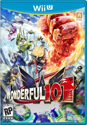
Not a fanboy, just a gamer...every system has its gems!!
12:07 pm
Site Veteran
Members
May 23, 2012
Offline
tkbryant said
Masamune said
That’s actually the first time I’ve seen the box for the Super Famicom. It’s ironic. The U.S SNES console looked like a toy to some, while the Super Famicom system box looks like it could be some sort of little children’s toy.Yeah I can see that analogy. I really wished they had left the design of the Super Nintendo alone & let us have the same look that Japan & Europe got. Everything about that system is sweet, even the cartridge shapes!! = )
The box looks very toy-like. I wonder if anyone custom painted theirs like that, including the pads!
Yep, I love the Jap/Euro console design and don’t envy the US owners one bit when it comes to the aesthetics – hell even the US pads got some naff purple/lavender button color scheme instead of the iconic mix of colors.

1 Guest(s)
